 Adam Bilsky
Updated :
Adam Bilsky
Updated :
| Note: This article contains video content that will not display or is not optimized to display correctly in the Foundry on-site support widget. For best results, we recommend reading the original in the Knowledge Base. Click the pop-out button |
Overview
This article explains how the Performance page works for students.
Contents
Targets and Credits Pages: What You See
Targets and Credits Pages: Using the Filters
Switching between Content and Skills Targets
Switching between Learning Plans
What does Subjects/Target Groups/Targets do?
What does Done / Done+ / To Do do?
Overview Video
| Note: The video below contains references to aspects of the Performance Page that have since been improved. Those improvements are shown in the still images on this page. The video will be updated. |
Purpose
In general, the purpose of the Performance page is to show you how much you have done, how much you have left, and how well you are doing - like any grade book, report card, etc. But Foundry was created to help schools where students and teachers focus on project-based learning, competency-based learning, and other learning models where 'grading' a project doesn't necessarily help students or parents see in detail what you learned.
You will see experiences listed on the Performance Page, but mainly, you see learning targets (standards, competencies, habits, etc.).
Targets and Credits Pages: What You See
Targets and Credits Views

The default view of the Performance page begins with Targets: the learning targets - known in some schools as standards or competencies - you've demonstrated with your work. The Targets and Credits views have the same layout and function, so they are described together here.
There are several ways to use these pages, but the overall purpose is to show you how much of your learning plan you have completed, which experiences you've earned your targets and credits, and how much you have left.
You can view both content and skills targets, and you can change how specifically you are looking at your performance - from the broad subject down to the narrow target. There are three large visual sections of the Targets and Credits views, and several filters that help you see exactly what you want to see. The visuals are the Performance Level graph, the Progress pie chart, and the Progress bar graph.
Performance Level graph

The "Performance Level Graph" quickly summarizes all the scale marks you have earned on all your individual learning targets by the mark you've earned. Many schools use labels like "Approaching," "Meeting," "Exceeding," etc for content and skills targets. The graph shows how many of each mark you have earned overall. The Trends page (click to skip to this section) shows this data in more detail.
Progress Pie Chart
On the right side of the page is a pie chart showing your overall progress toward completing whichever learning plan you have selected. Notice how more of the chart is complete when you are viewing a shorter plan (ex: 9th grade), and less is complete when viewing a longer plan (ex: Graduation). All the work you've done is there - it just represents different amounts of the whole in different plans.
The chart above and the progress bars below are color-coded:
Green: targets or credits you have completed;
Orange: targets* you have in progress - meaning you have active experiences with those targets assigned to them;
Grey: required targets not yet attached to an active learning experience;
Red (outside the bars to the left of the chart): targets you attempted but did not yet meet;
Blue (outside the bars to the right of the chart): targets you have completed beyond what is required by your selected learning plan.
| *Note: You earn targets as soon as your advisor evaluates them, even if an experience is still technically "active." But you only earn credits when your advisor marks the experience "completed," so they will not show as "in progress." |
Progress Bar Graph
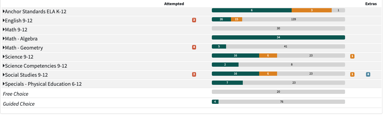
The bottom half of the page shows your progress in horizontal bar graphs. Where the pie graph above shows overall progress, the bar graph specifically breaks it down by Subject (ex: "Math"), Subject Group (ex: "Algebra 1"), or Learning Target (ex: "evaluating expressions"). You can switch the view of these bar graphs using the Subject / Target Groups / Targets and Done / Done + Attempted / To Do filters.
Targets and Credits Pages: Using the Filters
Content/Skills Toggle and Learning Plan Selector
Just above the Performance Level graph are two filters. The first is a pair of radio buttons that switch between showing Content targets and Skills targets. When you switch between them, the choices in the learning plan selector also switch between your available Content or Skills learning plans.
Below those is a dropdown menu that allows you to switch between showing one of several learning plans or to show everything you have done without looking at a particular learning plan (this is currently called Autoplan, and you can read about it here).
If you are not sure what this means, ask your advisor, or read about how learning plans work. In a more traditional school model, switching between plans is like seeing what you have to do to finish 7th grade compared to what you have to do to finish all of middle school.
All of your active plans are shown in the dropdown, plus a choice called 'User Default Plan.' The Default Plan is set by your advisor or school admin. This is what shows on the Performance page whenever you first open Foundry. It's also the plan Foundry uses to create your reports and transcripts.
If you are looking at a different plan and then choose 'User Default Plan' from the dropdown, Foundry switches back to whichever plan is the default and shows that plan in the selector. This is helpful in case you forget which plan is set as your default.
Subject Selector
Just above the Progress Chart (shown directly below) is a dropdown menu that allows you to narrow the view of targets - both in the pie chart and in the progress bars - to a single subject or subject group.
Subject / Target Groups / Targets
- The Subject button (the single bar at left above) shows completion of targets/credits in each subject only, by default; click it to close up the expanded views and show only subjects again.
- The Target Groups button (double bar, middle above) expands that view to see the Target Groups and targets/credits completed in each:
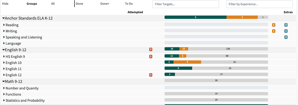
- The Targets button (three bars, at right above) shows completion at the deepest level - your individual Learning Targets. When you select this view, you will also see each experience in which the target was earned as well as the scale mark (ex: meeting) you earned on that target and the date you earned it.
Notice also that you can view a summary of what's required, completed, and remaining for each subject, subject group, or target by clicking into the bar itself:

Done / Done + / To Do
To the right of the Subject / Target Groups / Targets filters are the Done / Done +/ To Do filters.
The Done button (checkbox only) shows targets you have completed: you submitted the experience containing the target and earned at least the minimum mark to 'complete' the target.
The Done + Attempted button (checkbox with '+' sign, middle) show targets you've completed plus targets you have attempted, but did not yet meet. For example, you took a math quiz on exponents, and received a "not yet" or "approaching" mark:
The To Do button (empty checkbox, right) shows all targets you have left to complete. Out of those, the orange bars are targets you have in progress - meaning you have active experiences with those targets assigned to them. The grey bars are required but not yet attached to an active learning experience:
Credits View
Click the "Credits" button to switch to the credits view. The progress charts and filters work the same way as on the targets view, but this page shows you how many credits you have earned and how many are left - if your school uses credits.
|
Note: You earn targets as soon as your advisor evaluates them, even if an experience is still technically "active." But you only earn credits when your advisor marks the experience "completed," so they will not show as "in progress." |
Trends View
If you remember the Performance Level graph on the Targets page, the Trends view expands on that. Like the targets view, you can view both content and skills targets, and you can change how specifically you are looking at your performance - from the broad subject down to the narrow target.
However, the Trends page shows the number of marks you've earned on each target, or in each subject group or subject. So the Targets and Credits views answer the questions "How much have I done? How much do I have left?" But the Trends view answers the question, "How well am I doing?"
Whatever scale your school uses for evaluating targets is shown at the top of the chart. The chart above shows scale marks from "Not Yet" to "Exceeding." The highest scale value is always furthest to the right. Each time you earn a "Meeting" on a learning target, it is counted in the "Meeting" column in this graph. The darker the color (green in the images here), the more times you have earned that mark.
The yellow star on the chart indicates the most recent mark earned.
Subject / Target Groups / Targets on the Trends view
Like the Targets and Credits views, the default view shows your scale marks by Subject first (the single blue bar in the image above). You can click to open each subject and show all the target groups, or click
to open every subject group to see individual targets. The video below demonstrates what you see.
| Note: the video was produced before the Subject / Target Groups / Targets buttons were changed from text to the present icons, but the function is the same. |
Notice that when you click into a cell in the Subject row, a pop-up shows you all the experiences that earned the mark you clicked; the same is true if you click into the target group or individual target. The popup shows the definition of the scale mark as well.
Notice also that the Trends view does not use the buttons, but you can use that popup to see which experiences earned you each mark, and you can click to open the original plan.
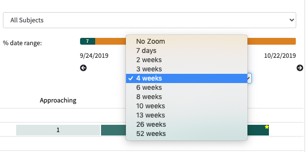
Zoom
Some school sites have a "zoom" feature enabled that allows you to break down the view by periods of time - from as short as a week to the whole year. This lets you move period-by-period to see how you did during each time window.
For example, if you choose "4 weeks", the chart will begin with the first 4 weeks of the current school term. Each time you click the direction arrow (right or left), you will move forward (or backward) to the next (or previous) 4 weeks, and you will see any marks earned during that time.
Comments View
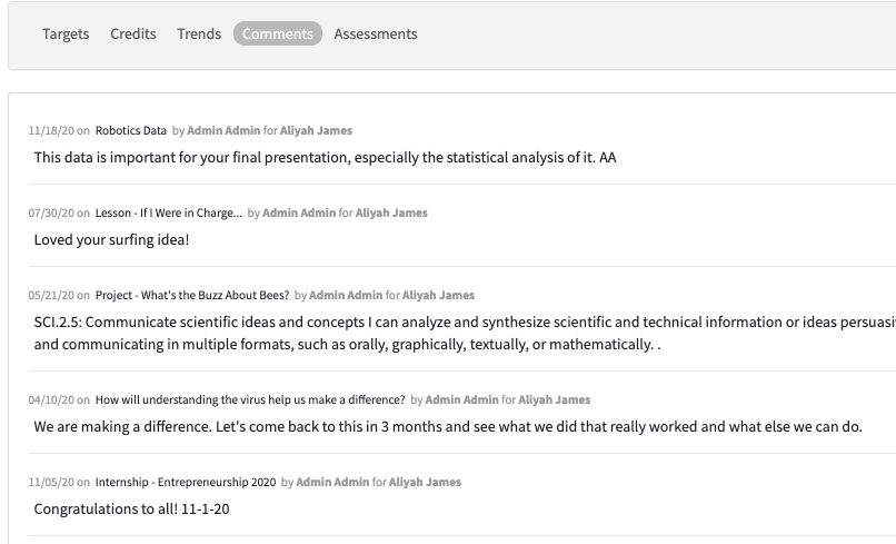
Currently, this view shows you the comments your advisor makes when evaluating a learning experience.
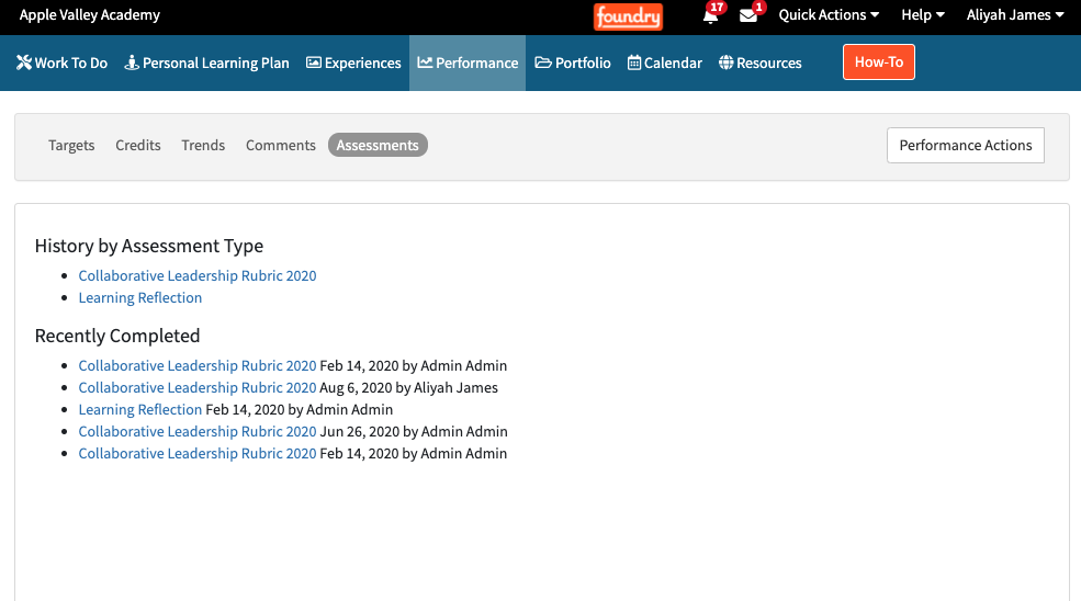
Assessments View
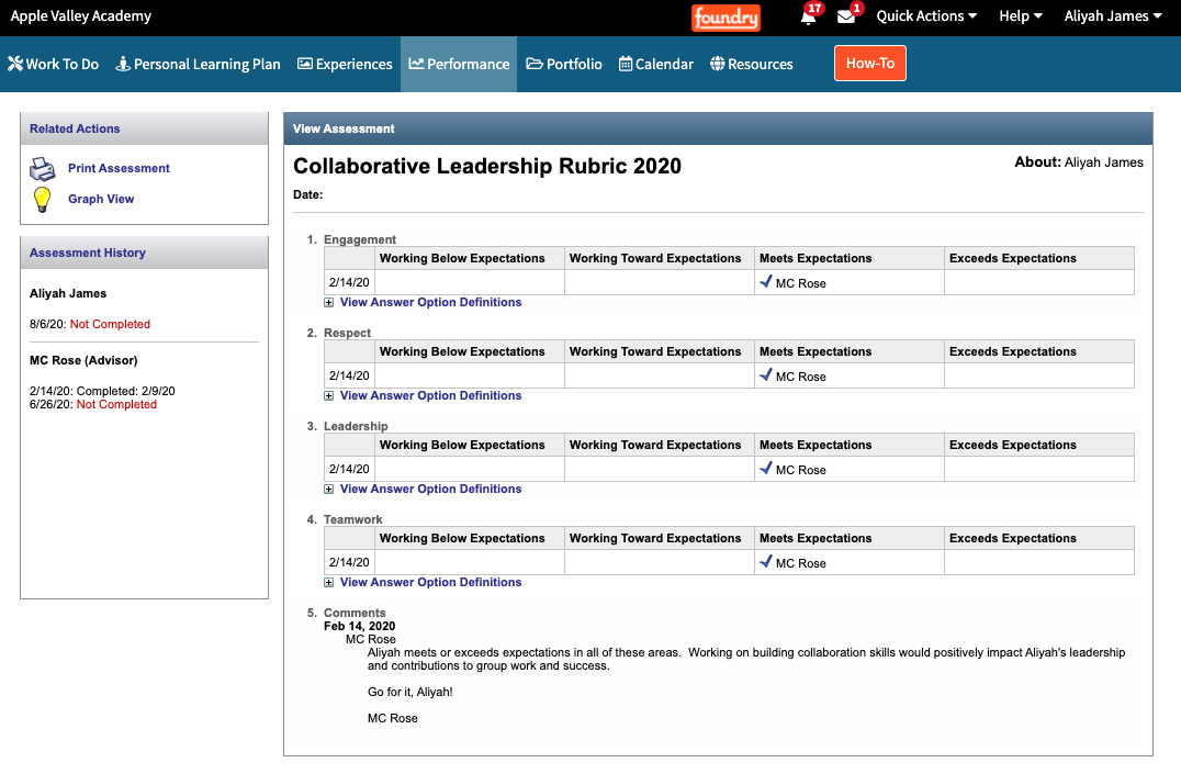
This view will show links to assessments you have completed, if your school uses them. "Assessments" in this context means Foundry-based assessments - they are multiple choice questionnaires you can complete in Foundry.
All completed assessments will be linked here:
You can open them to view the questions and answers:
Suggested Reading:
|
Note: Articles linked here under "Suggested Reading" are chosen by Foundry Support team members for their relevance and are updated as needed. The articles listed here may differ from those on the right side of the page, where the Knowledge Base AI lists "Related Articles." |
Labels: performance,
Comments